On my personal home front, I’ve been buried in our kitchen remodel project the last two months! Yes, I kind of abandoned our master bedroom update to focus on our kitchen remodel project. I am totally not following my own design advice: To complete one room before moving on to the next project!
I am sharing some progress pictures of our kitchen remodel today. We are very close to being done. All that’s left is touch up paint, some minor tile work, getting our vent hood up and finishing installing hardware. I was hoping we’d be done by yesterday, {actually, I had the very same hope last Friday, too} but now I’m optimistic that we will be done by next week with the exception of just a few pieces of delayed hardware. Then I can finally put up some of the decor up that’s been missing.
When we purchased this home almost 2 years ago, it needed quite a bit of updating. You can see the original home tour here and an updated home tour here. The house was in great shape, just a bit outdated and not our own personal style, so we did quite an extensive renovation before we moved in. Everything in that phase was updated except for a Jack and Jill bathroom, the master bath, the powder bath, the laundry room and kitchen. Now that I type that out, it actually kind of seems like a lot is unfinished!!
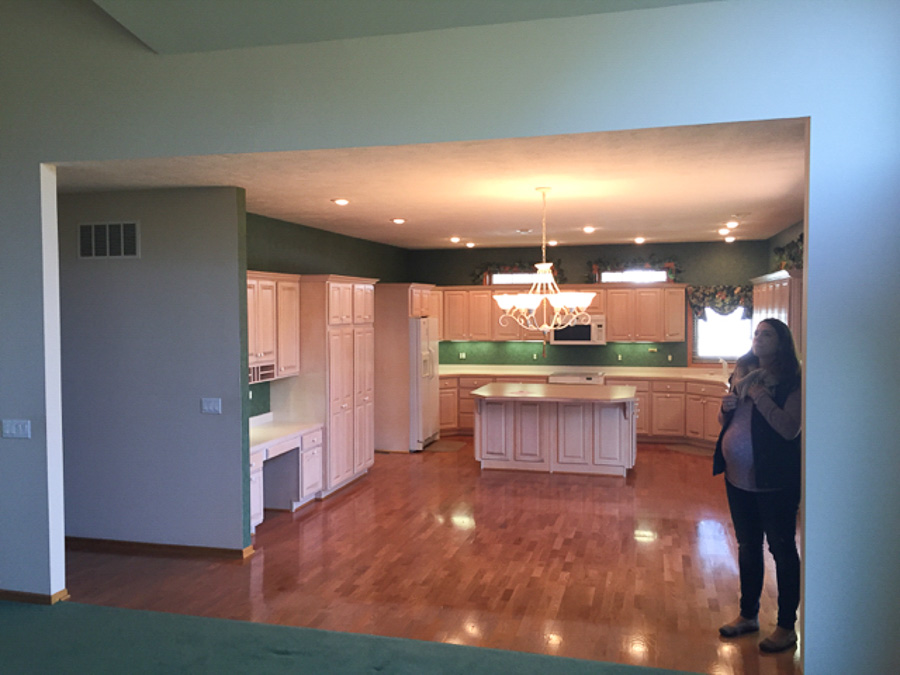
A throw back of a super pregnant me checking out our home for the first time on a quick scouting trip to find us a place to live in Nebraska. That’s dark green wallpaper, fake ivy on top of the windows and pink wood cabinets if anyone is wondering.
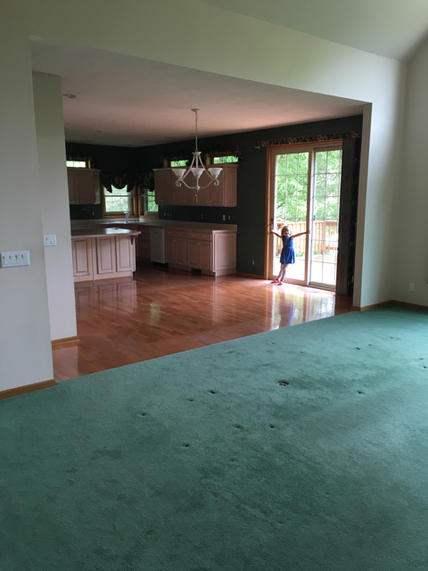
One of the things I really love about this house is the large kitchen. When we started exploring the idea of a kitchen renovation back in the Fall, we originally looked into completely gutting the kitchen and starting over. As much as I would have loved to do that, one thing would have led to another, and it just didn’t make sense for us to invest that much.
Our cabinets were in good shape, so we decided to keep the majority of them, and change out the door and drawer fronts to match our updated built-ins in our living room.

I also wanted the island to seat 4 and to be home to the new microwave for more room above the range, so the island is a new addition as well. Our fridge was also kind of on its last leg, and it wasn’t all that big for a family of 6. I mean, I was taller than it. Every new fridge I looked at was just a few few inches taller than our existing one and didn’t fit the existing fridge cabinet, so the cabinet guy reconfigured that cabinet to fit a standard size fridge.
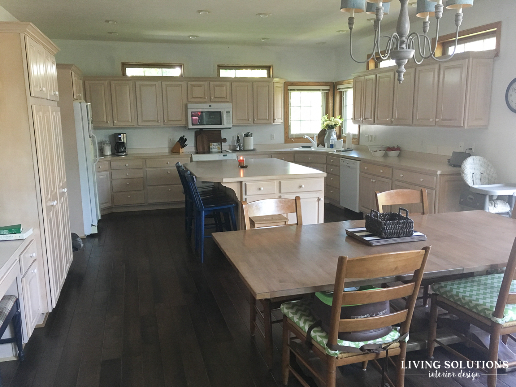
This is what it looked like a few months ago. All the dark green wallpaper had been removed, along with the pretty fake ivy touches! You can see all the different types of wood tones in here. The cabinets are known as “pickled,” which in my mind is just another way of saying “pink.” Yup, lots of pink cabinetry. And matching pink laminate counters {with a decorative wood trim} to match!
All the casings and doors were originally the more yellow/orange oak and we added the dark hardwood floors when we moved in. All the different wood tones just highlighted the aspects I wasn’t a fan of in this kitchen.

Another addition I really wanted was some kind of trim/divider for between the living room and the kitchen. It is such a big opening that had no interest or character and just seemed unfinished.


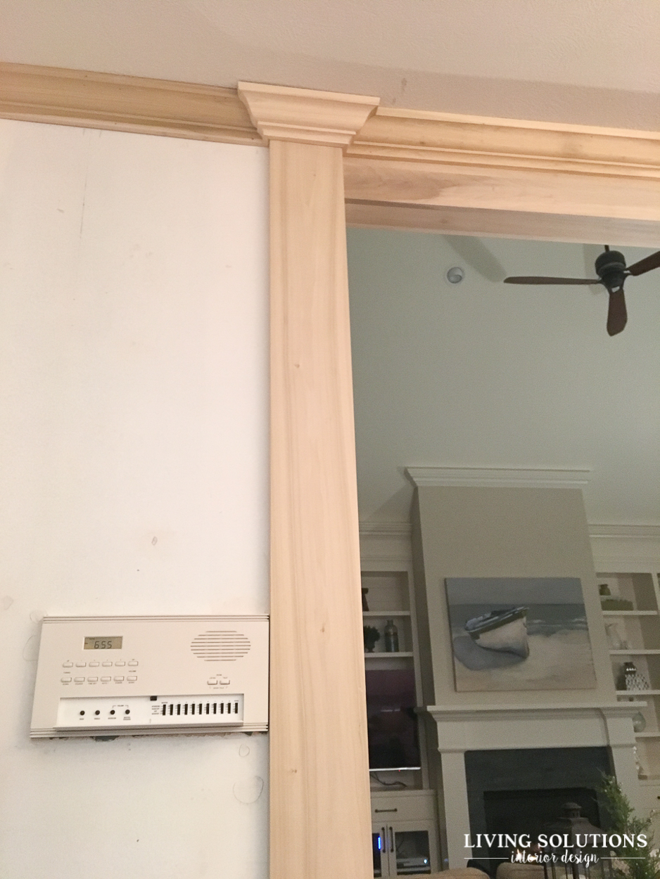
I designed the trim work “divider” with the cabinet guy so it complimented the fireplace mantle and built-in trim work. They are getting started on it here! All the trim wood is poplar. It’s smooth and easy to paint.
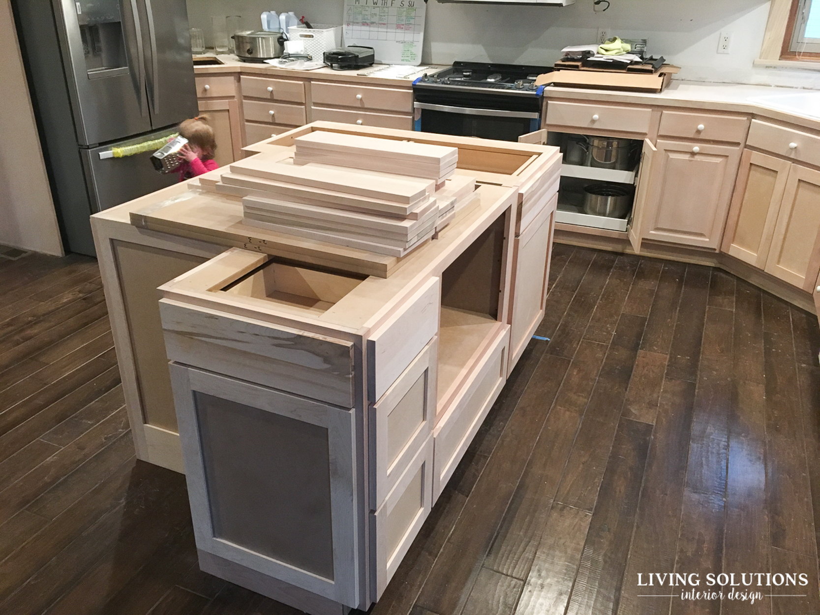
The new island cabinetry was installed on this day. Don’t mind the toddler with a cheese grader over her face. {it’s chaos around here most all of the time.}

This was her little hide out for a few days. :) Also known as the new home for the microwave/convection oven.
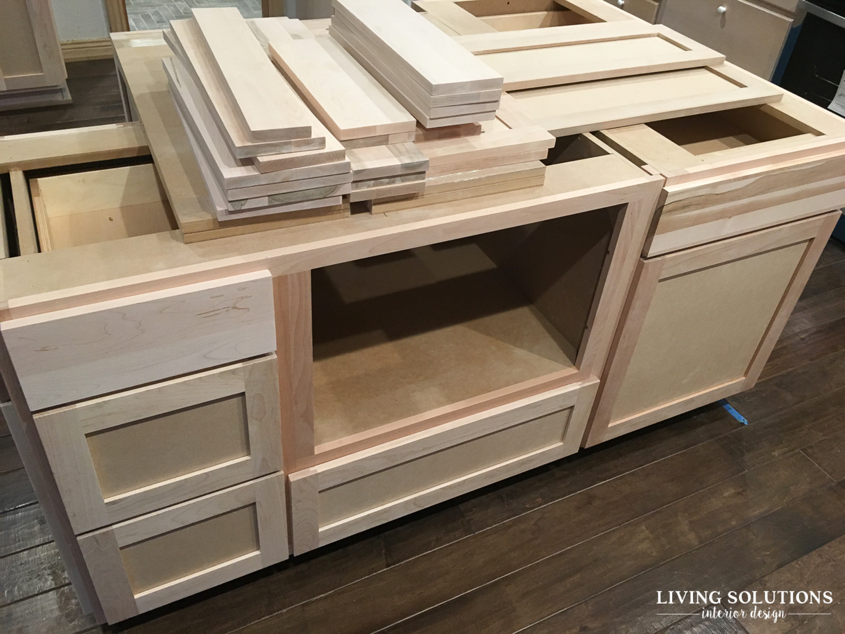
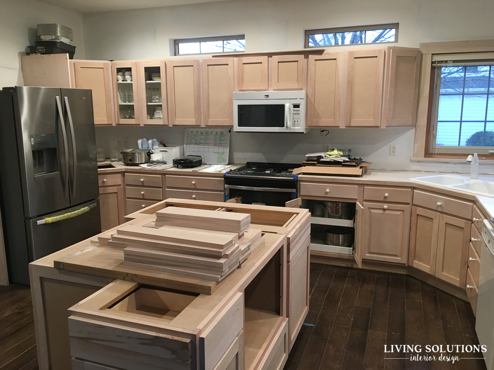
They put all the new cabinet doors on to adjust them and make sure they worked, only to take them off for painting. It was such a tease! The original crown on top of the cabinets also was removed at this point to get ready for updated trim.
The cabinet doors that you can see through eventually got glass. There is so much cabinetry in this kitchen and it visually needed some breaks with all the wood doors, so I planned out where it made the most visual sense to add glass fronts.
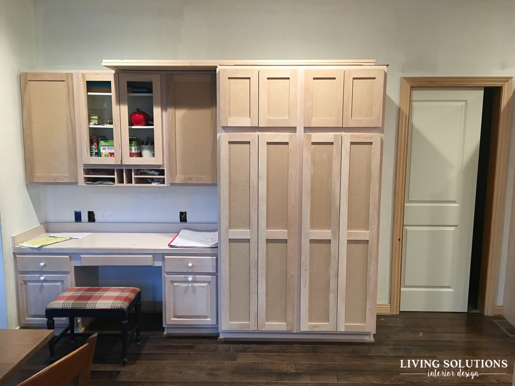
Outlets over the desk got moved down as well. They originally were in the middle of that wall and it wasn’t the best spot for them. Why do contractors/builders do that? So many times I’ve worked on projects with some kind of electrical in the middle of the wall. WHY?!?
I received a lot of questions on if we were keeping this large desk in the kitchen. And that answer is yes! Even though we have a designated office, one of my kids is ALWAYS sitting here. I would have loved to have a custom built-in china hutch here, {it’s all designed in my head!} and that was the plan when we were thinking of gutting the entire kitchen. But the more I thought about how our family actually uses this space, it made sense for us to keep it for now and kept cost down.
Will they always use this desk? Not sure, but with us keeping the original cabinets, I won’t feel like I’ve wasted a bunch of money if in 5-10 years we feel the need to redesign this area. We’ve got left over wood flooring and could fill the floor in and change the design to fit our future needs if we want.
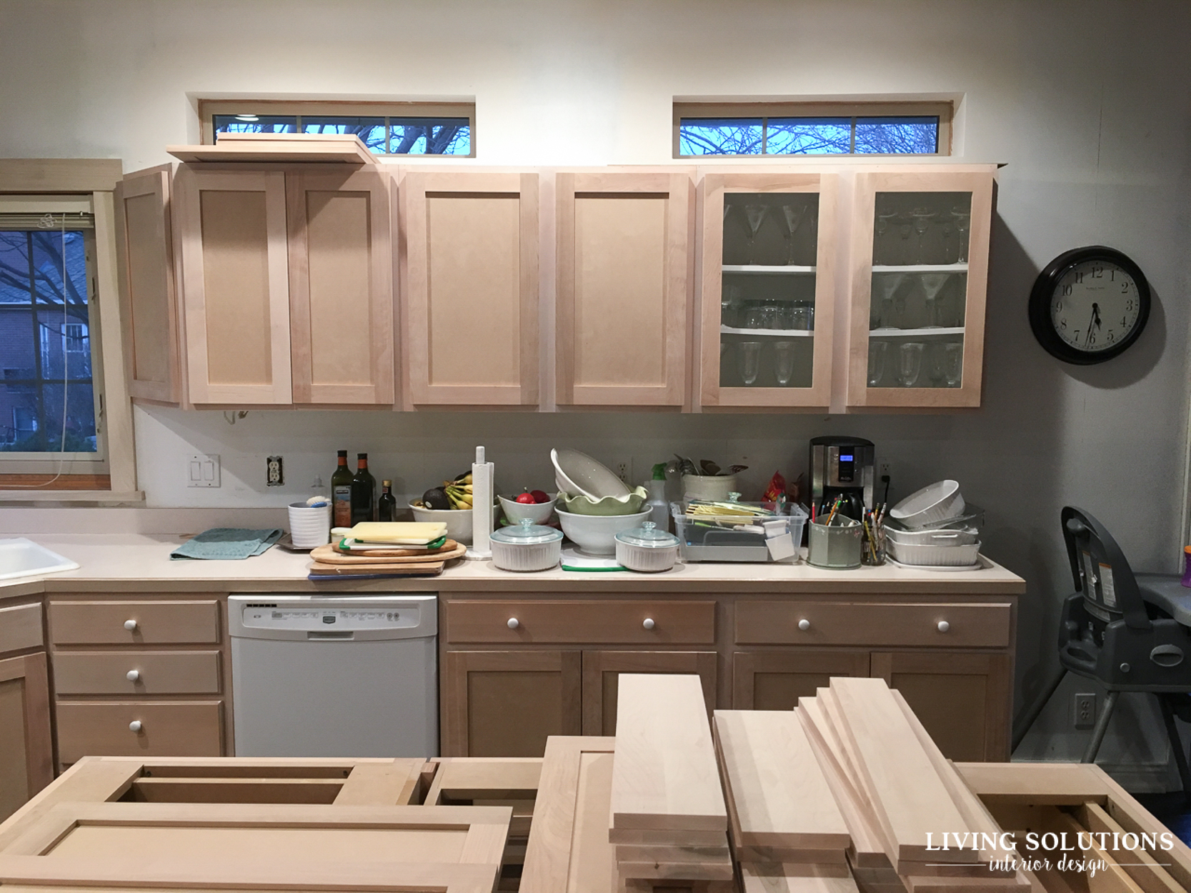
You can see here how the windows above the cabinets look without the wood trim. We ended up dry-walling all the way into the window and I love how they turned out! They used to be one of my annoyances about this kitchen and now, as it’s nearing completion, they have turned out to be one of my favorite design elements about the space.
As you can see, we were living in quite a bit of mess and more chaos than usual during this period. It felt like we were playing “musical drawer and cabinet contents,” and there was a constant layer of dust from the very start of demo.
 And here’s the new cabinet above the new fridge! It became a hinged cabinet that opens like a garage. The perfect place for my husband’s soft drink stash! Now I don’t have to look at a pile of stacked root beer on the counter!
Then it was time for the real fun to begin…
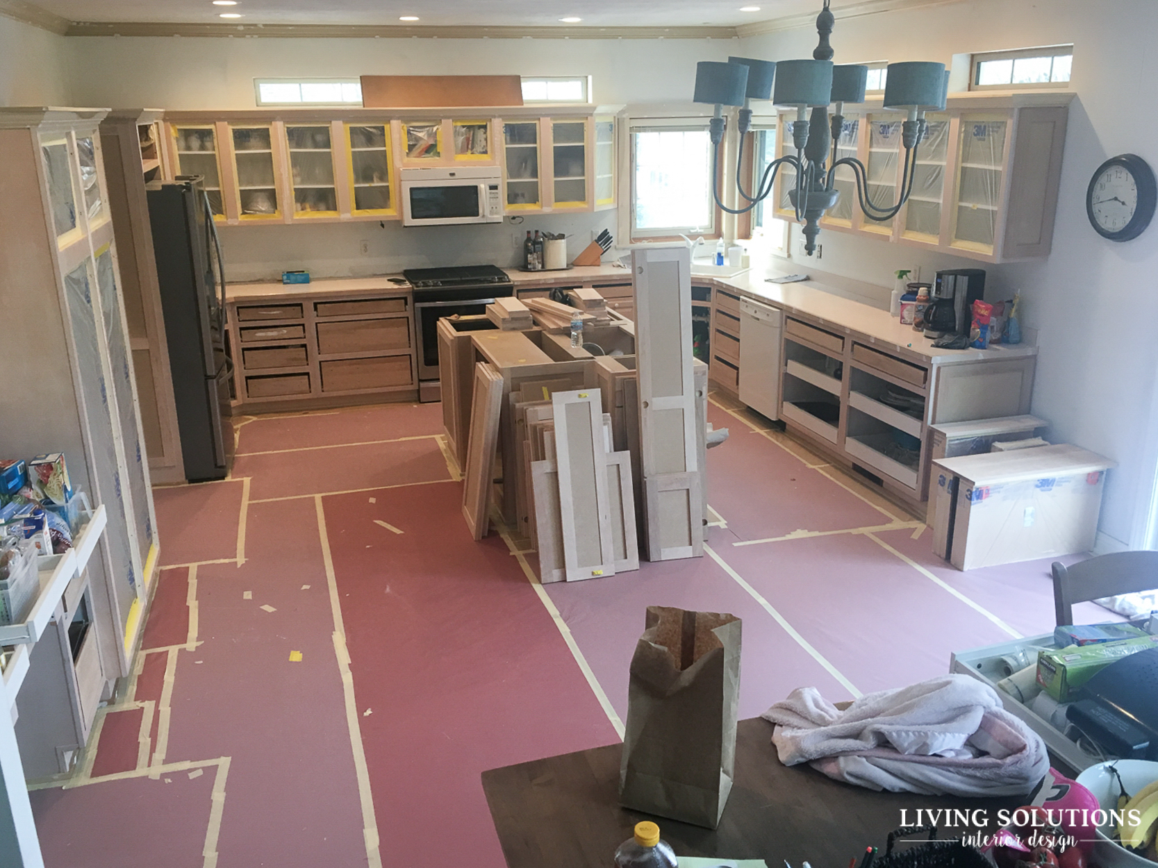
Prepping for painting. You guys, at this point, about 3+ weeks in, I was kind of over having guys in my house every single day and the mess and chaos that came with it. This took it too a whole other level.
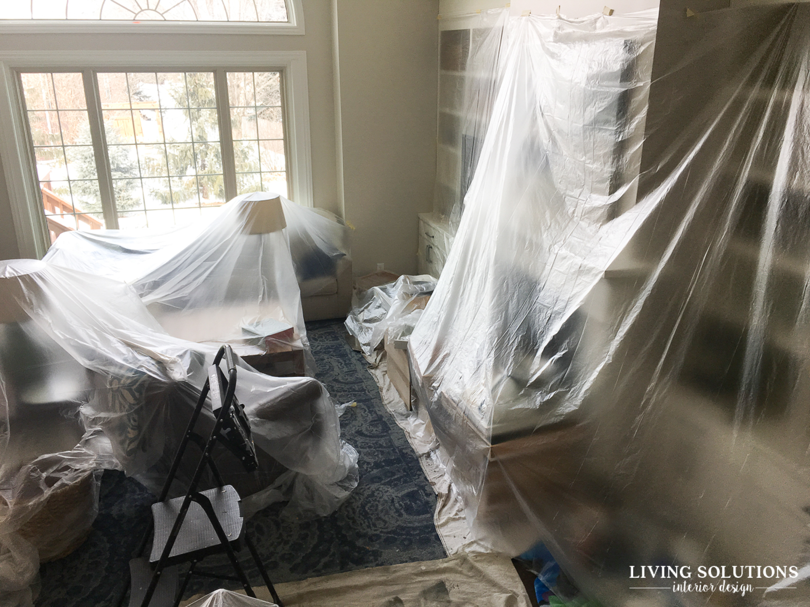
Just in time to coincide with our family getting hit with the flu. And moving to a hotel for a night while they sprayed oil based primer throughout the entire kitchen.
Fun times.

Here you can see the finished trim/beam work dividing the two spaces.
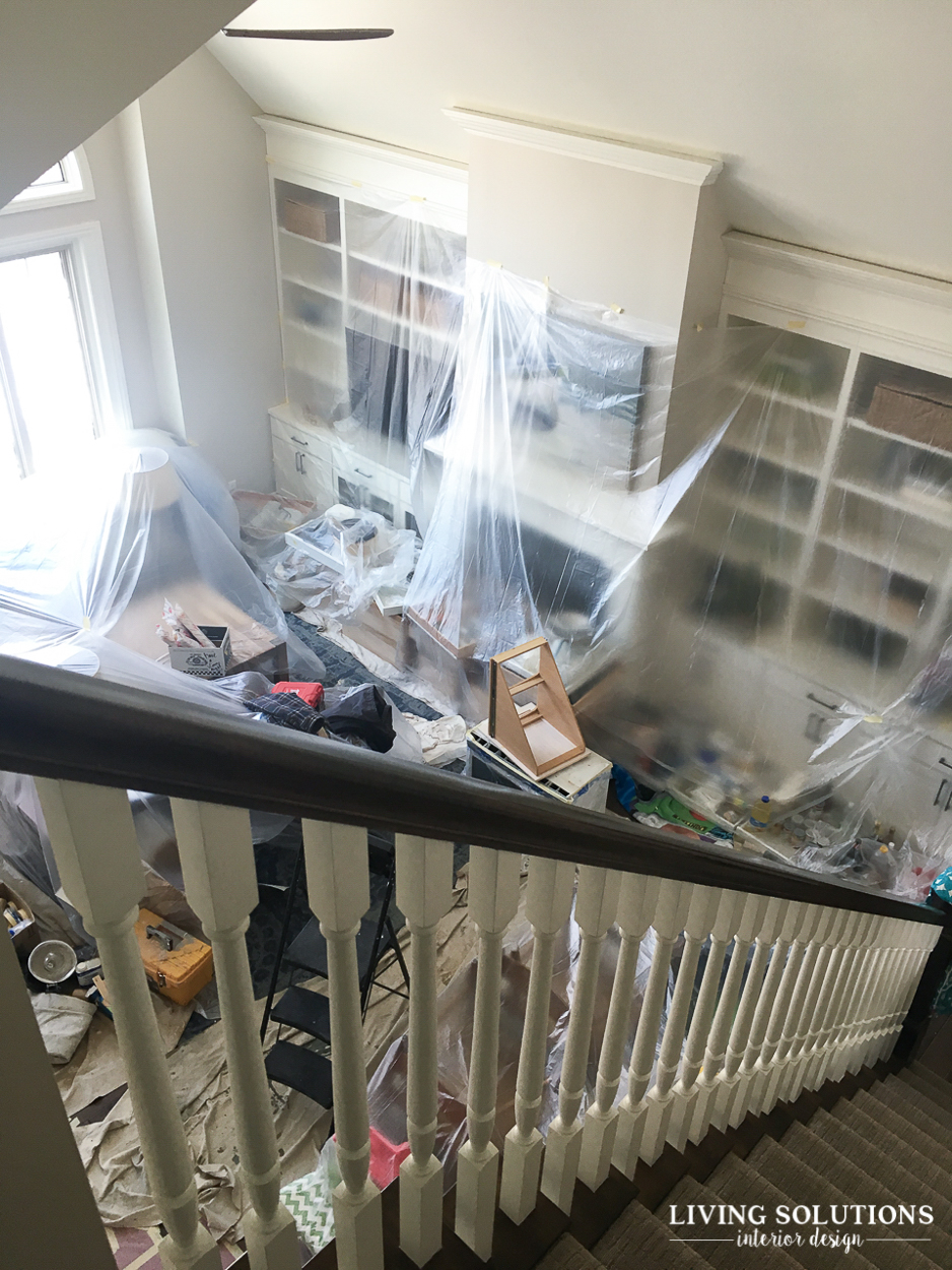
And our entire living room and kitchen contents covered in plastic.
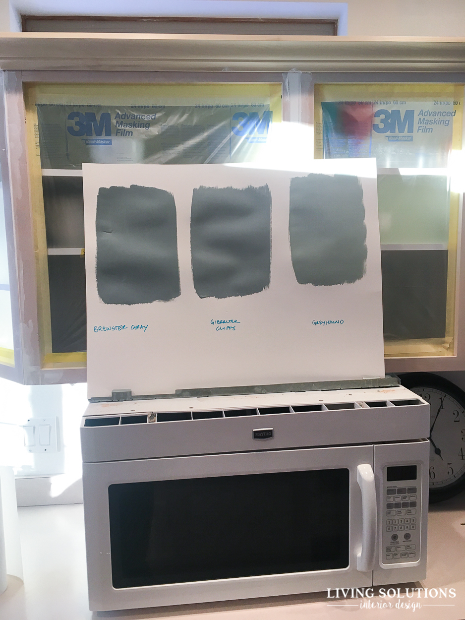
Somewhere in there I picked a paint color for the island. We went with the middle one, Benjamin Moore’s Gibralter Cliffs. It’s the perfect blue with a bit of gray and a tiny bit of green undertones.
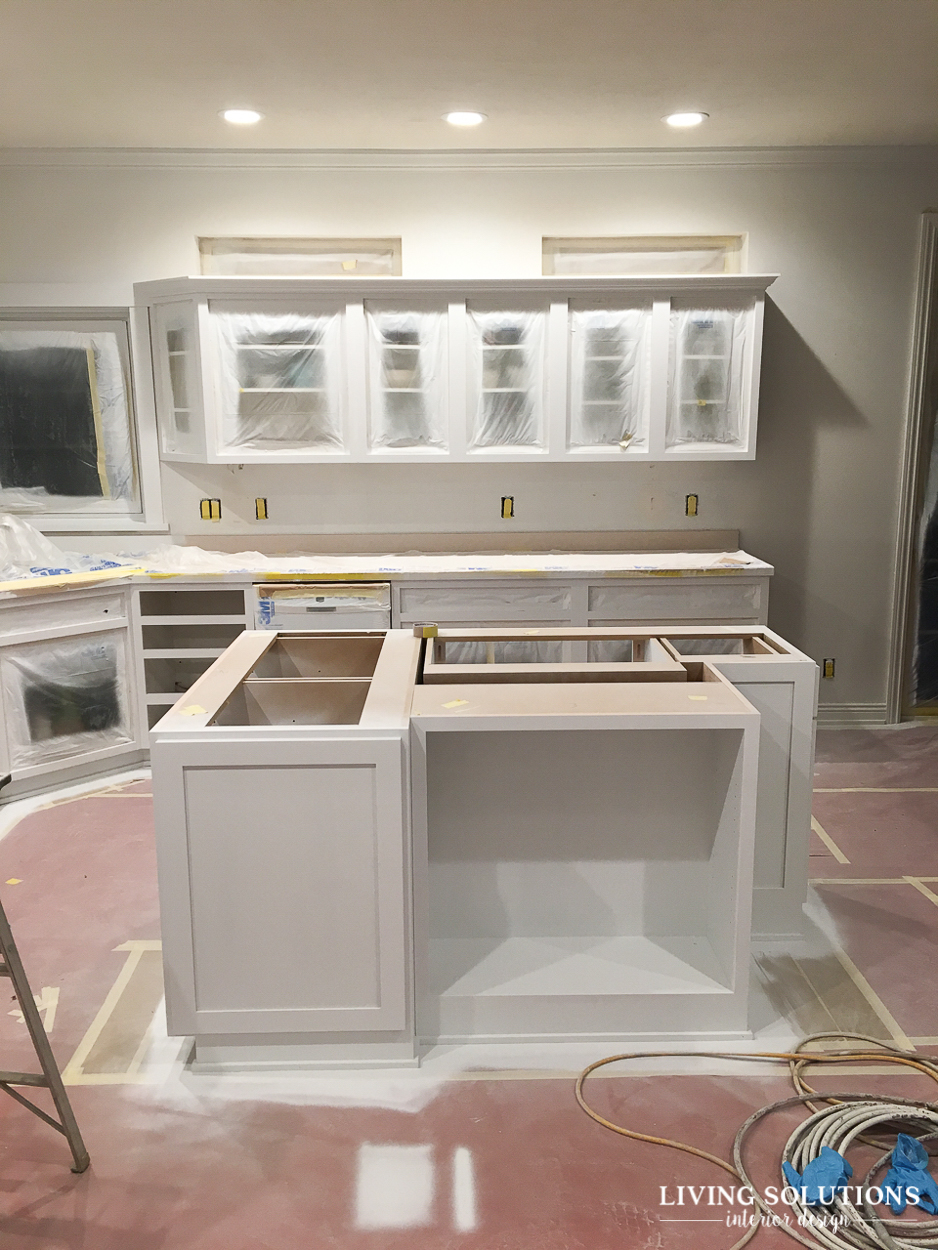
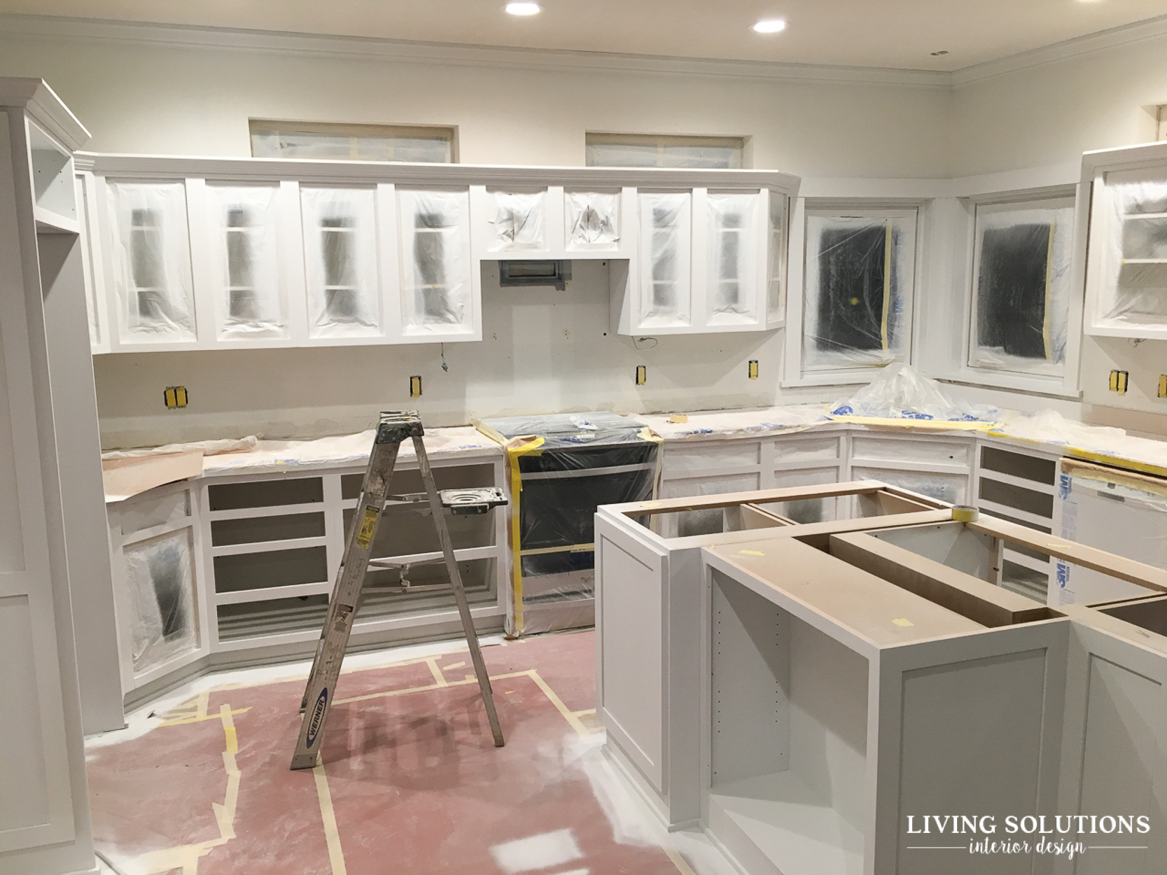

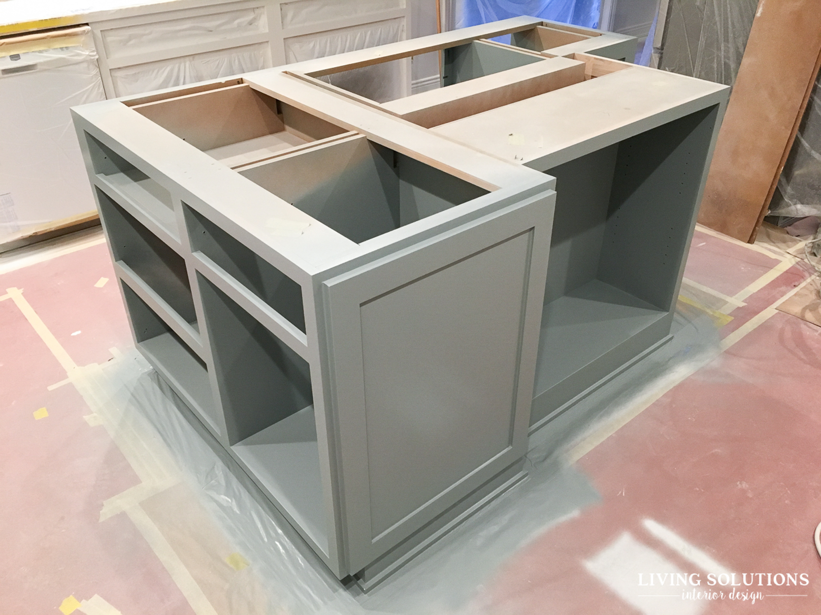
First coat of primer and then the first coat of the island paint! It started to look like a kitchen again!
Whew! That was a long one! And I didn’t even share the laundry room/mudroom progress. That’ll be next because we added that space as a part of this remodel project and it’s been a HUGE improvement!
I also want to make sure I’m always sharing real doses of reality here when it comes to designing a home you love. So I’m following up this post with some of the real truths of a home remodel project like this one in an upcoming post.
If you have your own remodeling project on the horizon, but don’t know where to start, I would love to work with you, even if you’re not local! Shoot me an email at gina@livingsolutionsid.com and we can chat about your upcoming project.
Let’s be friends!
Come find me on Pinterest // Facebook // Instagram // Twitter
I would love to connect with you!



This is some really good information about bathroom remodels. It is good to know that it would be smart to start with showers. That does seem like a good place to start if you want to make the bathroom more senior friendly. I should keep this in mind as my parents start getting older.
I like how you mentioned that you moved the outlets down towards the desk. My husband and I are going to be renovating our office, and the outlets being too high is something that has been driving me crazy. We’ll definitely follow suit and move those lower.
Great idea to put the plastic over your furniture while you’re painting. We’re thinking of getting kitchen renovations done. We’d like something tasteful yet elegant.